
Audacy: Embed Player Redesign
I led the redesign of Audacy's embed player to align with their refreshed app and web experience while focusing on increasing user engagement and total listening hours. The project required balancing visual appeal with functionality across multiple content types and platforms.
Year: 2022
Role & Responsibilities: UX/UI Design, User Research - I owned the redesign process, from initial research through final implementation specifications, conducting user testing at key stages to validate design decisions.
Impact: Increased user engagement and stakeholder alignment on content strategy.
Challenge
The embed player needed significant updates to address several key objectives:
Align visually with Audacy's site-wide redesign
Create a more visually compelling interface to capture reader attention
Convert article readers into active listeners
Increase total listening hours across the platform
Meet accessibility standards for contrast ratios
Satisfy editorial stakeholders' requests for a more eye-catching design
Target Audience
Readers of Audacy's digital articles
Users of affiliate sites that incorporate Audacy audio content
Project Constraints
Creating consistent experiences across four distinct content types (podcasts, live stations, rewind stations, and exclusive stations)
Ensuring responsive design across all device types
Accommodating varying metadata requirements for each content type
Maintaining accessibility standards while enhancing visual appeal
Design Process
Competitive Analysis
I began by examining embed players from leading audio platforms including Spotify, Apple, and Omny to identify industry best practices and potential opportunities for differentiation. This research provided valuable context for approaching our specific challenges.
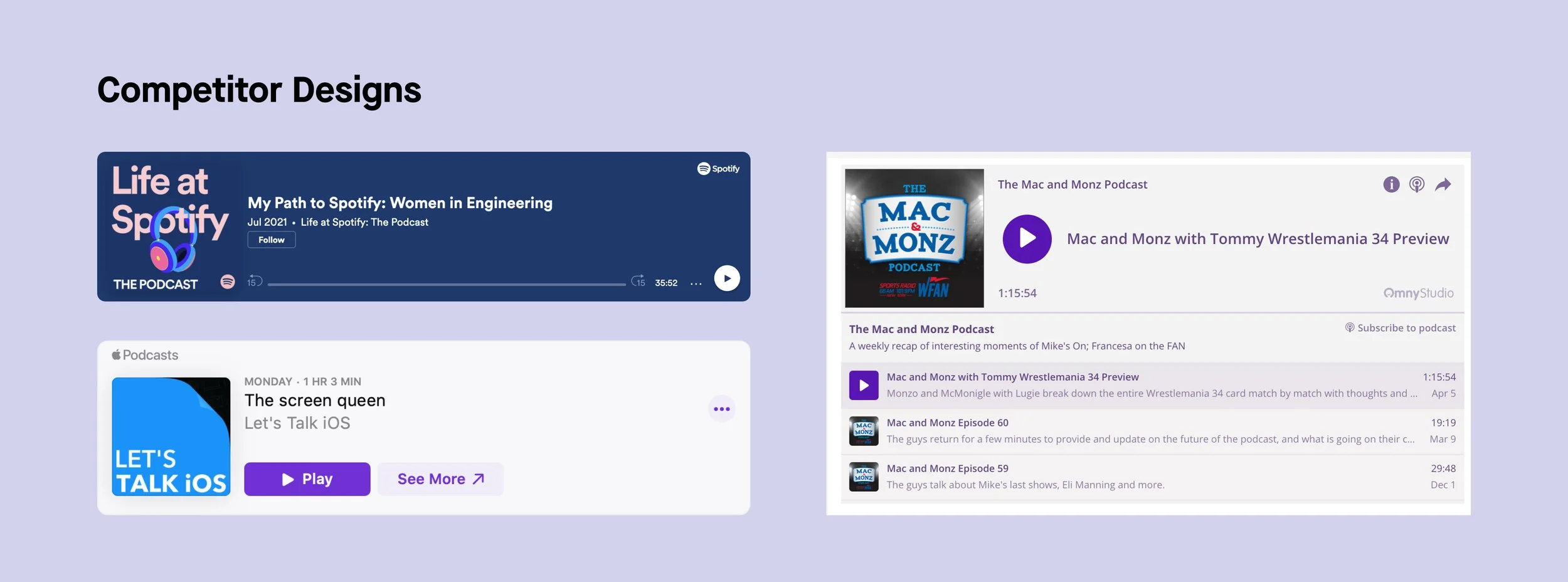
Examples of some designs found during competitor analysis
I also assessed the previous iteration of the embed player designs, taking note of areas of improvement. A big goal of this redesign was to better align visually with Audacy's recent redesign of it’s site and app.
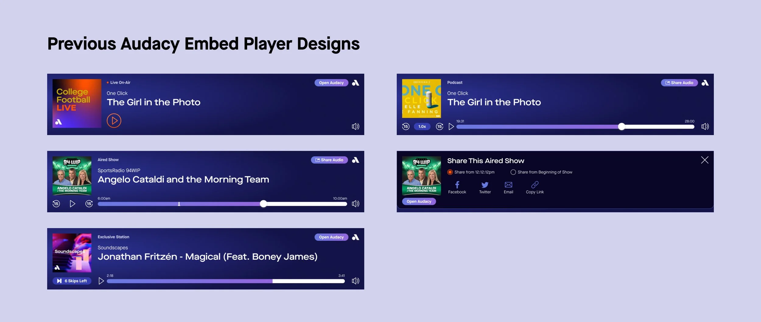
Examples of the previous designs
Stakeholder Collaboration
I facilitated discussions with the editorial team to understand their perception of the current player's limitations. Key insights included desires for greater visual prominence through color and size adjustments, potential integration with article images, and enhanced typography for titles and call-to-action elements. There was strong advocacy from the editorial team for using Audacy's signature orange color to reinforce brand identity and increase visibility. This presented an opportunity for me to educate stakeholders about accessibility requirements, as I needed to explain that their preferred orange color treatment would not meet contrast standards necessary for accessibility compliance. Through these conversations, I was able to guide expectations toward solutions that balanced brand goals with inclusive design principles.
Iterative User Testing
I designed and conducted multiple rounds of user research to validate design decisions:
First Round of Testing:
The first round compared the existing player against twelve potential variations (four color schemes in three different sizes). Users explored article mockups with different embed players and provided feedback on preferences, usability, and how noticeable it was on the page.
This testing revealed:
The medium-sized variations performed best, as users disliked the large version which felt intrusive and ad-like
The small version was criticized for making it difficult to understand the audio content due to its constrained cover image and content type label placement.
Users indicated the lack of context around the audio content was why they would choose to not engage with it
Versions that included 'Related Podcast' title above the embed player performed positively because it made it clear why it was included in the article

A selection of screens shown during user tests
Second Round of Testing:
The second round focused specifically on color preferences, testing various options including solid colors and gradients. Results showed users engaging more with simpler color treatments, though without strong preference for specific hues.
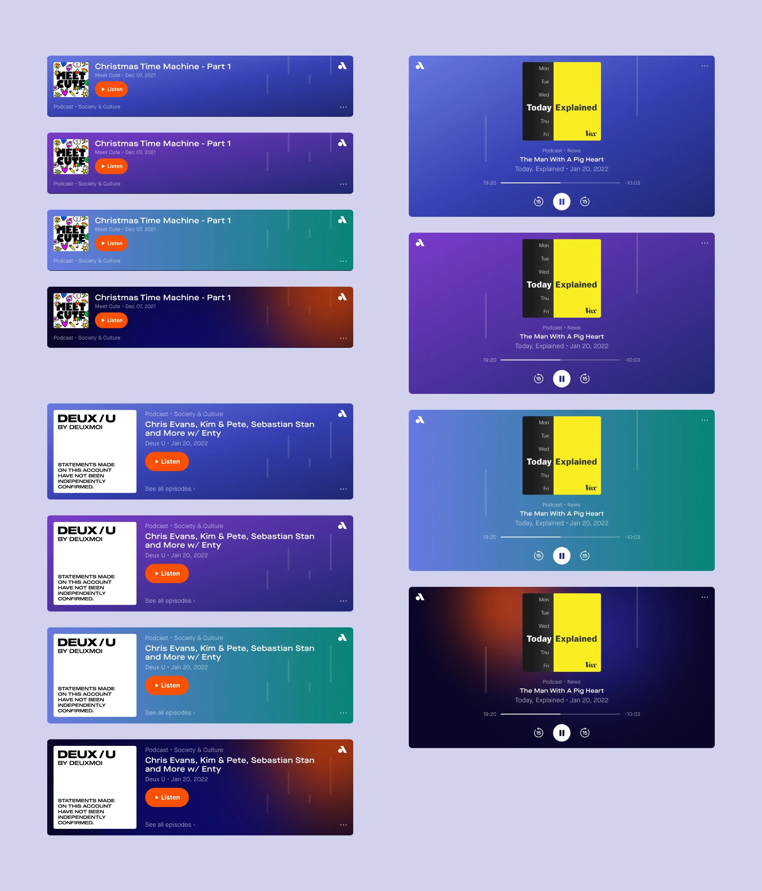
A selection of embed player variations shown during user tests
Design Refinement
Based on testing results of the different size and color variations, the medium-sized purple version performed best across user tests. Once we came to this conclusion, I then extended this design system across all breakpoints and content types, ensuring consistency while accommodating the requirements of each audio format.

Final designs in the different variations for each audio type and breakpoint
Solution Components
The final Embed Player redesign included:
Optimized Size Format: Medium-sized player balancing visibility with non-intrusive presence
Accessibility-Compliant Color Scheme: Purple variation meeting contrast requirements
Contextual Labeling: Clear "Related Podcast" indicators establishing content relevance
Responsive Layouts: Consistent experience across all device breakpoints
Content-Type Variations: Tailored designs for podcasts, live, rewind, and exclusive stations
Cover Art Integration: Enhanced visual prominence for audio content identification
Streamlined Controls: Intuitive playback interface optimized for engagement
Brand Alignment: Visual consistency with Audacy's refreshed digital experience
Results & Impact
The embed player redesign delivered meaningful improvements to both user experience and business objectives through a data-informed approach.
Engagement Increase: Successfully improved click-through rates on embedded audio content
Stakeholder Alignment: Used research findings to guide editorial teams toward more effective content strategies
User-Centered Solution: Identified that relevance of audio to article content was more important than visual treatment alone
Cross-Platform Consistency: Established visual cohesion between the embed player and Audacy's refreshed digital experience
Accessibility Compliance: Maintained strong contrast ratios while enhancing visual appeal
Most significantly, the process revealed that design improvements needed to work in tandem with content strategy. By sharing user insights about the importance of contextual relevance, I helped editorial teams understand that the most visually striking player would still underperform without appropriate content alignment, leading to more strategic audio placement throughout the site.